Glenergy
A design of an Employee Onboarding Portal that incentivizes users to choose cost-effective options for the distributor/business. We tested to identify the effectiveness of "Dark Patterns" and discern perceptions of AI integration in business applications.
Product Design
The Problem:
A mock client requested an employee onboarding portal designed to aggressively steer users toward cost-effective benefit options using "Dark Patterns" and deceptive visual hierarchy.
Dark patterns are deceptive user interface (UI) designs used on websites and apps to manipulate users into taking actions they did not intend, such as purchasing insurance, subscribing to services, or revealing personal data.
The Constraints:
Our client noted limitations for this project.
This project sprint needed to account for financial motivations by the business.
The technical features needed to be more profit-oriented and business-centric, tasking us with changing minor details related to the user experience.
This project needs to include an AI-integrated chatbot.
By the end of the two-week sprint, we need to have conducted user interviews and present findings alongside a pitch for the client.
The Process:
As designers, my team stands between the business and the user. In this scenario, we have the responsibility to balance both parties' needs effectively. I initiated conversations in our team about the ethical considerations that result from our design decisions, establishing a consensus about how we approach this project.
We developed three progressively assertive interface iterations. By conducting user testing on the early stages, we measured how specific behavioral nudges—such as altered visual hierarchy and friction in the opt-out processes—impacted both user decision-making and psychological sentiment.
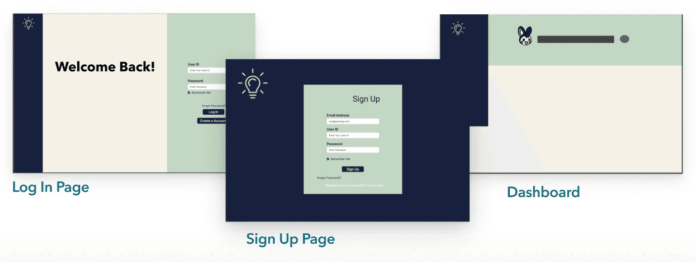
We began by iterating on user flow and low-fidelity mockups.
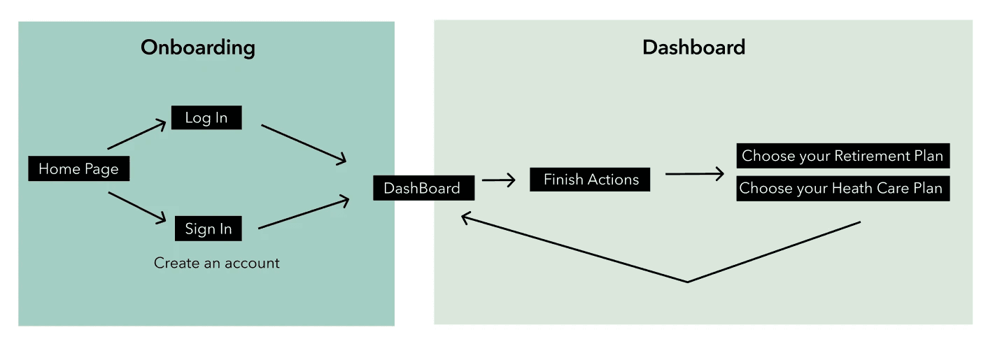
User Flow
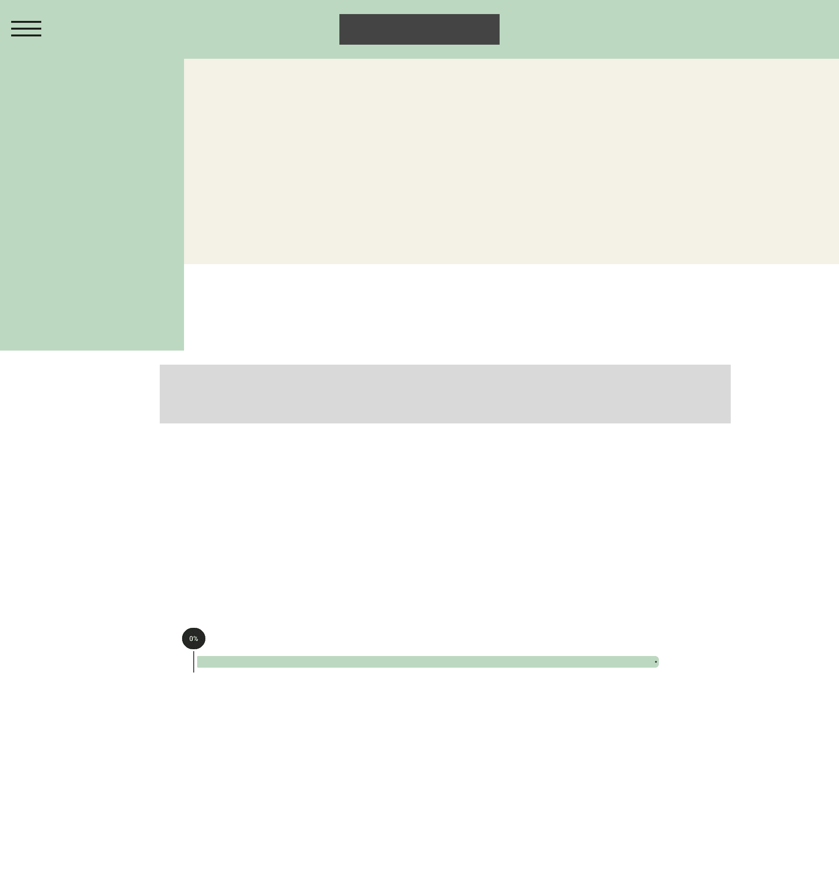
Low-fidelity Dashboard Page
Low Fidelity Plan Intro Page
Low-fidelity Stage 1 Screens
Manipulative AI Chatbot Iterations
The Outcome:
Through user testing and a client meeting, our team identified User Pushback on the manipulative design: Users felt reduced trust in using the portal, software, and business. We then translated the results into the next steps for more human-centered design.
"I feel like AI is everywhere, and incorporating it here would be great, but I don't know how much I would trust or rely on it for my financials."
Metrics
3/5 users chose to decline the AI chatbot feature.
4/5 users were skeptical in donating through a corporation to charity.
5/5 users felt confused when interacting with the deceptive client-recommended idea for employer matching.
"Tell me more where my money is going? Explain more about the charities and why I should donate to certain charity."
User Interview Takeaways
The data revealed a critical business trade-off: while the aggressive designs successfully skewed user choices toward cost-saving options, they triggered a severe drop in employer trust. Users recognized the manipulation, demonstrating that short-term financial gains via dark patterns create long-term risks to employee retention and brand perception.
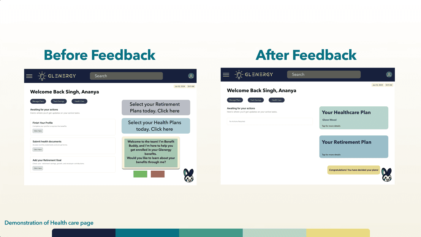
Before/After of Home Page
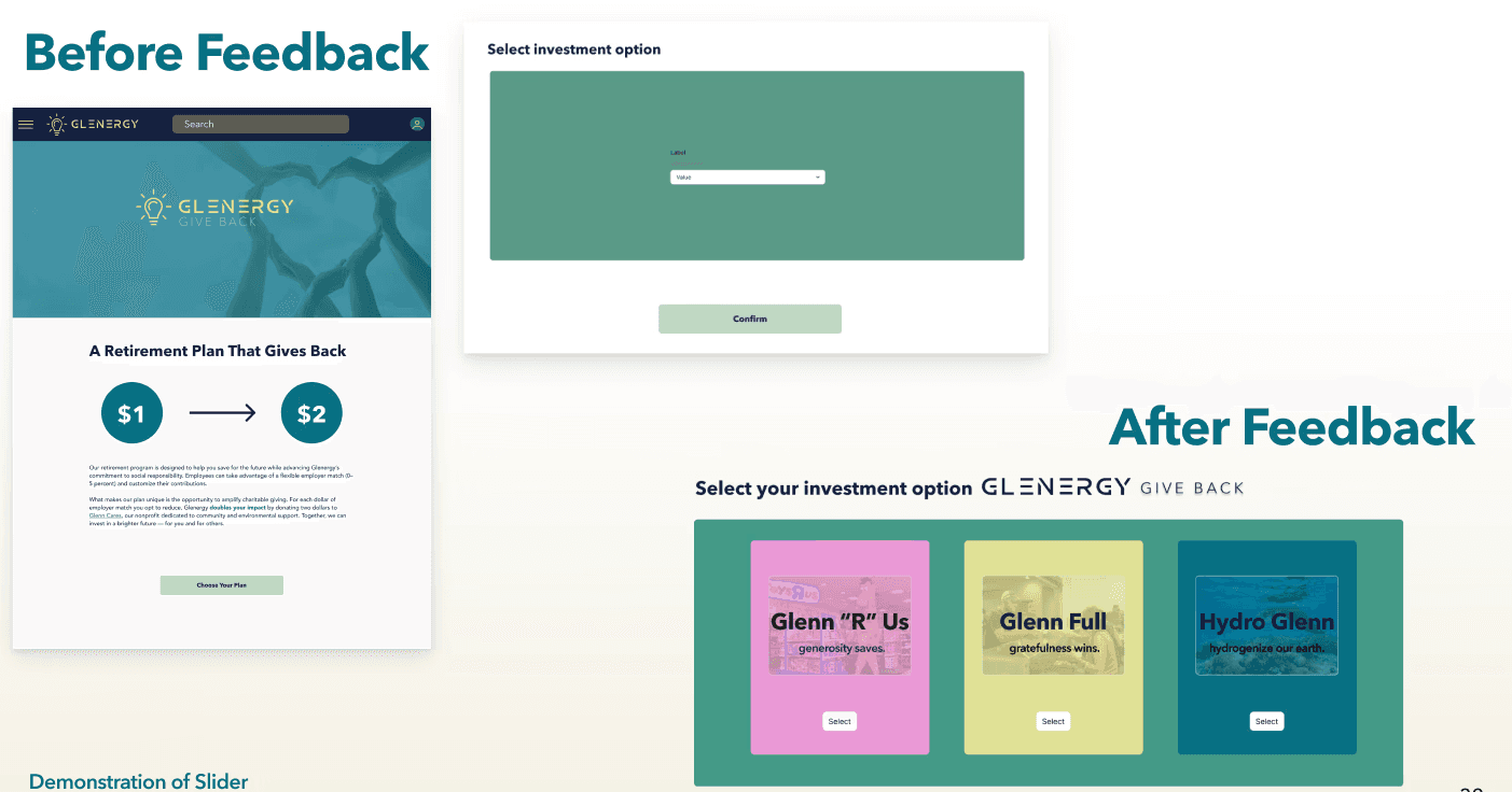
Before/After of Retirement Plan Page
High Fidelity Choice Page
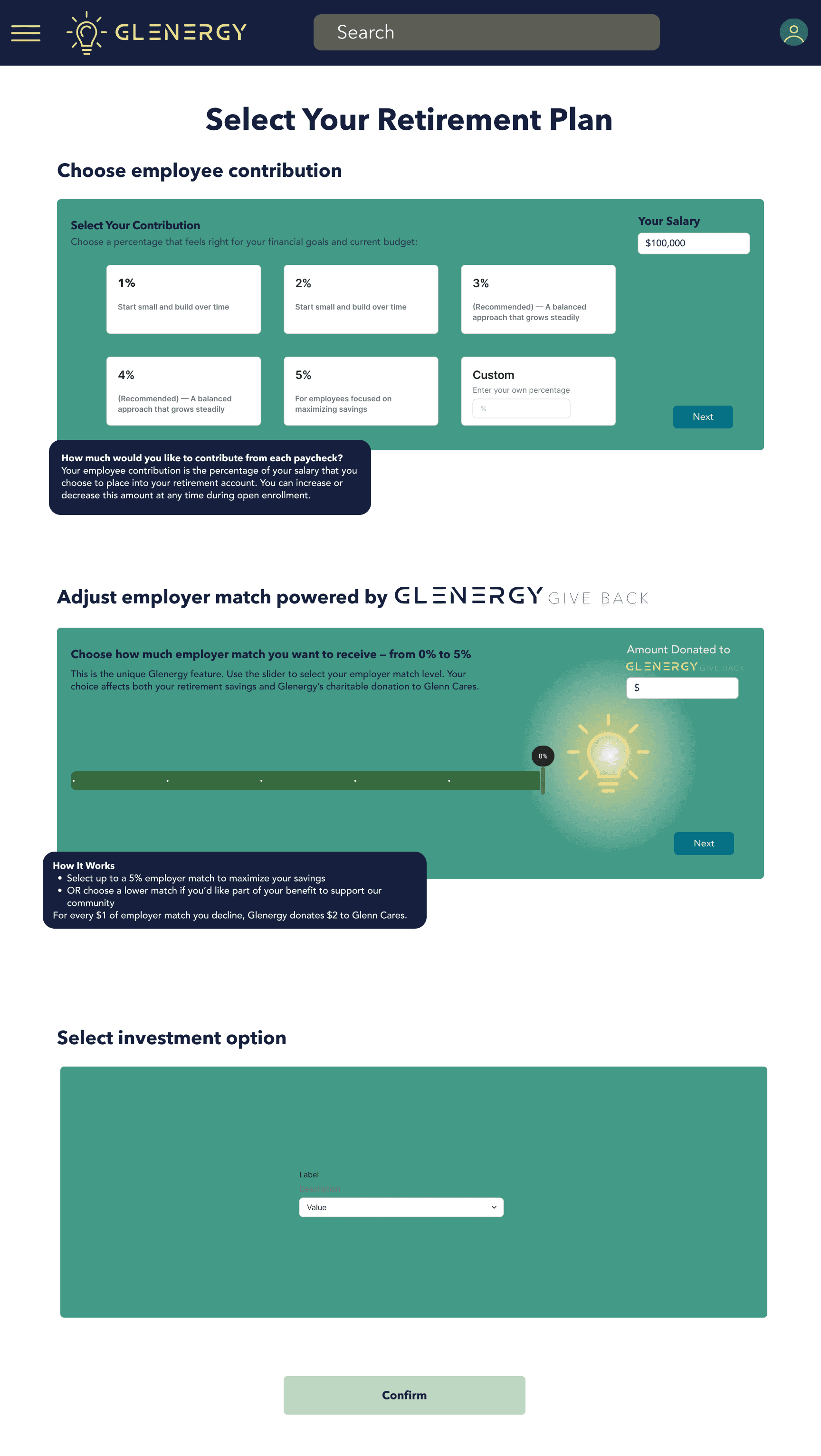
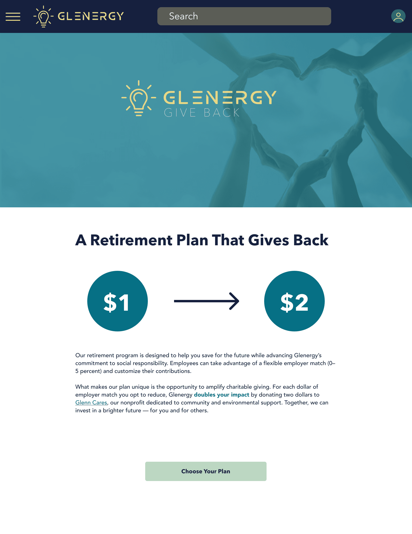
High Fidelity Plan Page
My Role:
UX Researcher & Designer
(Team Project, Expanded further designing high fidelity mockups as a solo project)
Metadata:
- Role: UX Designer, Researcher
- Timeline: 4 weeks, Fall 2025
- Team: Peter Huang, Devynne Best, Ananya Singh
- Tools: Figma, Zoom
To see our Pitch and Story:
Project Artifact Gallery


